
As many of you might be already familiar with, multi-class classification is the task of categorising samples into one of multiple classes, or groups. For instance, if our samples are NIR spectra measured for different concentrations of a specific compound, the task will be to infer such (discrete levels of) concentrations from the spectra. Other applications may involve distinguishing between product categories, or identifying different formulations, etc. from spectral data.
The term multi-class is used to identify tasks that involves more than two classes, as opposed to binary classification, when only two classes are considered. We have discussed examples of binary classification tasks on this blog:
- PLS Discriminant Analysis for binary classification in Python
- Binary classification of spectra with a single perceptron
Many real-world problems however don’t have binary outcomes, and can be better modelled with a multi-class approach. Increasing the number of classes raises not only the complexity of the model, but also the complexity of its evaluation. Many useful classification metrics, such as accuracy, precision, etc, need to be carefully evaluated when it comes to multi-class outputs.
In this post, I’m going to discuss a few basic approaches to multi-class classification using an NIR dataset of mixtures of milk powder and coconut milk powder. The dataset contains 11 classes and it’s available at our GitHub repo.
My aim is to present some basic code to implement a classifier and evaluate its performance. Nothing too fancy, but hopefully the right amount of details to get an understanding of the basic concepts.
NIR spectroscopy data
The spectra were collected on mixtures of samples containing milk powder and coconut milk powder in different concentrations. The task will be to train a classifier to predict the concentration from the spectra.
Let’s begin with the imports
import pandas as pd
import numpy as np
import matplotlib.pyplot as plt
from scipy.signal import savgol_filter
from sklearn.decomposition import PCA
from sklearn.linear_model import LogisticRegression
from sklearn.preprocessing import StandardScaler, OneHotEncoder
from sklearn.dummy import DummyClassifier
from sklearn.pipeline import Pipeline
from sklearn.model_selection import GridSearchCV, cross_val_predict

from sklearn.metrics import classification_report, confusion_matrix, roc_curve
from sklearn.metrics import RocCurveDisplay, roc_auc_score
Second, we load the data, smooth the spectra and take the first derivative
data = pd.read_csv('milk-powder.csv')

lab = data.values[:,1].astype('uint8') #labels
spectra = data.values[:,2:]
X = savgol_filter(spectra, 9, polyorder = 3, deriv=0)
X1 = savgol_filter(spectra, 11, polyorder = 3, deriv=1)
We have a total of 220 NIR spectra, 20 spectra (samples) for each label (percent milk), for 11 labels in total going from 0% milk powder, to 100% milk powder in step increments of 10% measured by weight. This is how the first-derivative spectra look like, when averaged over all 20 scans of each concentration
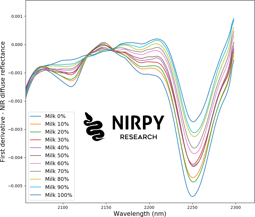
The spectra can already distinguish between classes and a clear trend is visible as the composition of the sample changes. For instance in the wavelength region around 2200 nm the intensity of the signal grows with increasing milk powder concentration.
One could look at an exploratory PCA analysis such as
pca = PCA(n_components=3)
Xpca = pca.fit_transform(StandardScaler().fit_transform(X1[:,:]))
and explore a scatter plot of the components:

Multi-class classification pipeline
For the classification exercise, we’ll use all of the individual spectra (no averages).
First, we build a pipeline, i.e. a chain of operations that we want to perform on the data. In this example, we are going to apply a Standard Scaler, a Principal Components decomposition and a Logistic Regression, in this order. This means that we are going to apply the Standard Scaler to the smoothed spectra, then apply PCA to the scaled data, and finally use logistic regression on the PCA components.
Logistic regression is one of the oldies-but-goodies classification approaches (yes, despite its name, logistic regression is a classifier), and will be discussed in this blog in the future. Without discussing too many details for now, we will be using logistic regression to predict either the label of samples, or the probability that any sample belongs to a given class. These two different approaches can be chosen depending on the type of evaluation that is required.
The quality of our classification does in general depend on the numerical value of some of the parameters. In our case these parameters are the number of principal components and the value of the regularisation parameter C of the logistic regression (for more technical details check out the Scikit-Learn page on logistic regression). The parameter optimisation is done with the GridSearchCV function, which systematically explore the parameter space at each point that we specify (we discussed pipelines and grid search for regression in this post). Here’s the code
pipe = Pipeline([('scaler', StandardScaler()),
                 ('pca', PCA()),
                 ('logit', LogisticRegression(max_iter=1000))])
parameters = {'logit__C':np.logspace(-3,0, num=4),
              'pca__n_components':np.linspace(1,10,10).astype('uint8')}
gs = GridSearchCV(pipe, parameters, scoring = 'accuracy', verbose=0, cv=2, n_jobs=8)
gs.fit(X, y)
print(gs.best_estimator_['logit'])
The first line defines the pipeline with its three constituents. The second line specify the free parameters and their associated range of values. The third line defines the GridSearchCV object, which is then fitted on the data in the fourth line. The fit will generate a gs.best_estimator_ object which contains the optimal values of the parameters.
Side note 1: Running this code on the data produces, in my case, a warning, advising that the maximum number of iterations of the logistic regression has been reached without the algorithm converging. This is likely due to the very small number of samples, but it can be potentially ameliorated by increasing the max_iter parameter in the code above.)
Side note 2: I’ve chosen 2 cross-validation splits, which is (I guess) lower than what you’d expect. Typically you’d go with 5 or 10 splits, but I deliberately used 2 because it gives a poorer result for the first two classes (I know), which is not something you want in general, but it will help us understanding the metrics better.
Anyway, once the optimal parameters have been found, we can obtain cross-validated results applying this estimator as follows
y_cv = cross_val_predict(gs.best_estimator_, X, y, cv=2, n_jobs=8)
print(classification_report(y, y_cv))
print(confusion_matrix(y, y_cv))
Let’s now explain the metrics.
Classification report and confusion matrix
The quality of the prediction is evaluated by printing the classification report and the confusion matrix.
In our case the classification report looks like this
             precision    recall  f1-score   support

           1       0.50      0.80      0.62        20
           2       0.20      0.05      0.08        20
           3       0.68      0.75      0.71        20
           4       0.65      0.75      0.70        20
           5       0.94      0.75      0.83        20
           6       1.00      0.95      0.97        20
           7       0.83      1.00      0.91        20
           8       0.95      0.95      0.95        20
           9       0.95      0.90      0.92        20
          10       0.90      0.90      0.90        20
          11       0.90      0.90      0.90        20

    accuracy                           0.79       220
   macro avg       0.77      0.79      0.77       220
weighted avg       0.77      0.79      0.77       220
On the left, running from 1 to 11, are the 11 classes which our samples belong to. For each class, we obtain three metrics: precision, recall and F1-Score.
- Precision is the fraction of true positive prediction against all predictions in a given class. For class 1 this is equal to 0.5, or 50%. This means that out of all samples that have been predicted to belong to class 1, 50% do actually belong to class 1.
- Recall is the fraction of positive predictions in one class against all samples that belong to that class. For class 1 this is equal to 0.8, or 80%. This means that 80% of the samples belonging to class 1 have been correctly predicted by the classifier to belong in that class.
- F1-Score is simply the harmonic mean of precision and recall, so it will sit somewhere in between.
I’ve singled out class 1 above, because precision and recall have quite a different value for this class. This means that our classifier is labelling as “class 1” many samples (just as many samples in fact) that do not belong to class 1. Therefore the precision of this classification is just 50%. However, 80% of the (true) class 1 samples are correctly classified. As it will become clear in a minute with the confusion matrix, the problem is that we have most class 2 samples that are classified as belonging to class 1, and the metrics for class 2 are very poor.
Another important metric is the accuracy, which is given as an average value in the third-last line of the report. The accuracy is the fraction of samples that are correctly classified, counting all classes. That is obviously a useful metric, but since it’s calculated over all samples, it fails to identify potential problems, as the one we have just discussed in the classification of class 1 and class 2. Note that this is a key difference between multi-class and binary classification. In the binary case, the accuracy does give quite a complete description of the model: a sample can only be classified into one of two classes, and therefore the accuracy score is quite significant. On the contrary, in a multi-class classification, a sample could be misclassified into one of many classes and the accuracy is only part of the story.
To understand this issue more deeply, Let’s print the confusion matrix, which for the case above looks something like this
[[16  4  0  0  0  0  0  0  0  0  0]
 [16  1  1  2  0  0  0  0  0  0  0]
 [ 0  0 15  5  0  0  0  0  0  0  0]
 [ 0  0  5 15  0  0  0  0  0  0  0]
 [ 0  0  1  1 15  0  3  0  0  0  0]
 [ 0  0  0  0  1 19  0  0  0  0  0]
 [ 0  0  0  0  0  0 20  0  0  0  0]
 [ 0  0  0  0  0  0  0 19  1  0  0]
 [ 0  0  0  0  0  0  1  1 18  0  0]
 [ 0  0  0  0  0  0  0  0  0 18  2]
 [ 0  0  0  0  0  0  0  0  0  2 18]]
This makes very clear the issue with class 1 and 2. Of all the samples that do belong to class 2 (i.e. the sum of the values on the second line) only 1 is correctly predicted, while 16 are misattributed to class 1. Of the other classes, most are correctly classified with some misclassification in the neighbouring classes. (As hinted at above, if you choose cv=5 in the cross-validation, most of the samples are indeed correctly classified. I avoided doing that so as to have the chance to discuss the nature of precision and recall.)
Therefore, with the exception of classes 1 and 2, the accuracy of classification is fairly good. It is the problem with class 1 and 2 that brings the average classification down and the issue would not be noticeable if we were to look only at average values rather than at all samples. A detailed look at individual samples can be done using other tools, such as the ROC curve, which we discuss below.
We close this section by making a (perhaps obvious) point about the numerical values of the results. We have 11 classes, so if we classified our results completely at random, we would expect the accuracy to be on the order of 1/11 or about 9%. You can verify this directly, using the Dummy Classifier of scikit-learn, which, as the name implies, predict values by completely ignoring the spectra. Try running the following code
y_dummy = cross_val_predict(DummyClassifier(strategy='uniform'), X, y, cv=5, n_jobs=8)
print(classification_report(y, y_dummy))
print(confusion_matrix(y, y_dummy))
and see for yourselves. A dummy classifier would on average produce an accuracy of 9%, which is the value we need to compare the accuracy of our classifier with.
ROC curve
The ROC (Receiver Operating Characteristic) curve is a graphical representation of the quality of a binary classifier. Let’s produce a ROC curve for class 1 and then discuss its meaning. Here’s the code (this example has been inspired by this post on the Scikit-learn website)
y_score = cross_val_predict(gs.best_estimator_, X, y, cv=2, n_jobs=8, method='predict_proba')

enc = OneHotEncoder()
enc.fit(y.reshape(-1, 1))
yenc = enc.transform(y.reshape(-1, 1)).toarray()

RocCurveDisplay.from_predictions(
    yenc[:, 1],  # <- The index 1 means we are selecting class 2
    y_score[:, 1], # <- as above
    color="darkorange",
)
plt.plot([0,1],[0,1], '--')
plt.axis("square")
plt.xlabel("False Positive Rate")
plt.ylabel("True Positive Rate")
plt.title("Class 2 vs rest")
plt.legend()
plt.show()
There is a bit to unpack here. Let’s begin with the first line, which produces a cross-validated prediction obtained by the same estimator that was fitted above, only this time we are predicting probabilities rather than classes. If we were predicting classes, the output of the estimator would be the class number. When we predict probabilities instead, the output for each sample is an array with 11 values (we have 11 classes) and each value is the probability of the sample belonging to one of the many classes.
For instance, if we print the first element y_score[0] we get
array([9.94867838e-01, 2.17164335e-04, 4.91369655e-03, 1.28950881e-06,
       3.71090123e-10, 1.10701682e-08, 1.11875076e-15, 5.21440169e-20,
       4.26455303e-26, 3.32085693e-33, 2.24185195e-52])
According to the classifier, this sample has about 99.5% probability of belonging to class 1, 0.02% probability of belonging to class 2, and so on. Clearly there is little ambiguity for this sample. Compare this with another sample, for instance y_score[21] which is
array([6.80461767e-01, 1.82500676e-03, 3.15732292e-01, 1.95661385e-03,
       8.96607865e-06, 1.53540373e-05, 3.66238230e-10, 9.68522578e-15,
       1.58204371e-19, 8.47262252e-25, 2.59210569e-42])
Now this sample is attributed a probability of 68% to belong to class 1, and about 31.6% to belong to class 3. While class 1 is still preferred, there is a non-negligible probability of class 3 being selected. This case is not so clear-cut and situations like this one in real cases lead to poorer results or reduced accuracy.
If we want to compare the array of probabilities as calculated with the true results, with need to apply a OneHotEncoder. The reason is that the true-values array (y) is an array containing one value per each class, and we want to transform it to an array with 11 values per each class, So for instance if a sample belongs to class 1, the one-hot-encoded label will be [1,0,0,0,0,0,0,0,0,0,0] . This is comparable to the array of probabilities discussed above, only this time we are certain (probability equal to 1, or 100%) that the sample belongs to class 1.
Therefore, by comparing a cross-validated probability array to the the corresponding true value, we can asses if the prediction was correct or incorrect.
And this brings us to the ROC curve. The ROC curve is here drawn for a single class, namely class 2 which, being the one the gives the worst result, it’s instructive to consider. Take the array yenc[:, 1] . This elements of this array will be 1 if the sample belongs to class 2 and 0 otherwise. Similarly, the elements of the array y_score[:,1] will be the probability of each of the elements belonging to class 2 according to the classifier. Now, obviously, by comparing the two arrays we can asses the quality of the class 2 classification versus all other classes (“one-versus-rest”). So, we are back to the binary classifier case. In this case we could assume that, if the probability is larger than 50%, the sample is classified as class 2. If it’s less than 50% it will be classified as not class 2.
In such cases one can distinguish between:
- True positives (TP), i.e. the sample belonging to class 1 that are correctly attributed to class 1.
- True negatives (TN), i.e. the samples that do not belong to class 1 and are correctly classified as not belonging to class 1.
- False positive (FP), i.e. the samples that do not belong to class 1, but are classified as class 1.
- False negatives (FN), i.e. the samples that belong to class 1 but are incorrectly classified as not belonging to class 1.
For the purpose of drawing a ROC curve, we are only interested in the trend of FP vs TP as we change the probability threshold for the classifier. The ROC curve is a chart where the FP value is on the horizontal axis and the TP value on the vertical axis.The result of our code above produces the following plot

If you were to draw this plot by hand, you would consider the array y_score[:,1] and assess (by comparing it with the the corresponding value in yenc[:, 0] ) how many true positive and false positive values you would get by progressively decreasing the comparison threshold.
For instance, let’s start with a threshold equal to 1 and assess the array y_score[:,1]<=1. This is a boolean array whose elements are all Flase, since the y_score[:,1] array values are probabilities, hence generally less than 1. If “True” is a positive element, an array whose elements are all False will have zero positive values. Hence, trivially, both FP = 0 and TP = 0. This is the first point in the ROC curve (orange line) in the plot above.
Note that the the code above will look at the rate of occurrence of FP and TP rather than their absolute value. The rate is the value divided by the total number, hence bound between 0 and 1.
Now, let’s decrease the threshold value by a bit, for instance consider the largest element of y_score[:,1] to be the new threshold. At this point, we expect that a single element of the nee boolean array will be True (the one corresponding to the maximum value of y_score[:,1]) and the rest will be False. If this single element is a True Positive, we move one step up in the ROC curve. If it’s a False Positive, we move one step to the right instead.
This process is repeated, progressively decreasing the threshold, until all the elements of the array will be True. In this case both FP rate and TP rate will be 1, which is the point on the top-right of graph.
The concept just described is implemented in the roc_curve metric in scikit-learn which is used as
fpr, tpr, thresholds = metrics.roc_curve(yenc[:,1], y_score[:,1])
and it outputs the FP rate, the TP rate and the thresholds used in the computation.
AUC score
The shape of the ROC curve tells us something about the quality of the classifier. A dummy classifier, which will assign random probabilities to each of the point, is expected to produce a ROC curve similar to the dashed blue line in the chart above. That is the line of random chance. Consequently, the more the actual ROC curve will sit above the line of random chance, the better our classifier will be.
This can be quantified by the Area Under Curve (AUC) value. The AUC of random chance is 0.5. In the example above we achieve 0.86. The maximum value is theoretically achieved when the ROC curve is a step function that jumps up to 1 at the first step. In this case we would have AUC=1.
The AUC score therefore quantify the ability of our classifier to distinguish between TP and FP across all possible threshold values. It is a single numerical value to assess the performance of the classifier. It is however distinct form the accuracy, which is the fraction of the results that are correctly classified. The latter is affected by the relative balance (or inbalance) between the classes. This is easy to understant with a simple example. Suppose we had samples belonging to two classes, and 90% of the samples belong to class 1 and 10% to class 2. A classifier that would predict all samples to belong to class 1 would be 90% accurate, but obviously useless in our task of identifying class 2 sample when they occur.
AUC score on the contrary is much less sensitive to inbalance as it assesses the relative rate of positive values regardless of the number of samples.
***
Well, thanks for reading until the end and until next time!


