
Principal Components Analysis (in short, PCA, see here and here) is a linear decomposition methods that transforms a set of variables (for instance spectra) into an equivalent set of transformed variables called principal components (PCs). The PCs are orthogonal (i.e. independent of one another) and are sorted in order of explained variance. The correlation circle is a visualisation displaying how much the original variables are correlated with the first two principal components.
In this tutorial, we are going to learn how to plot a correlation circle and, most importantly, how we can make good use of it in exploratory analysis. We will start with a toy example using the iris dataset and we’ll move on to an example using PCA decomposition of a series of NIR spectra.
The
datasets library of scikit-learn contains the iris dataset (any many other datasets). We go ahead and load it, and run a PCA decomposition after having scaled it using a standard scaler (side note: for an example of combining scaling and PCA operations, see our post on pipelines)
The original iris dataset contains 150 samples (50 sample per species) and 4 features. After PCA decomposition, since we decided to keep the first two principal components only, we are left with 150 samples and 2 features.
The idea behind the correlation circle is to calculate the correlation of each of the 4 original features with the two principal components. By correlation we mean the Pearson correlation coefficient, which has a value between 1 (perfect correlation) and -1 (perfect anti-correlation).
Once the correlation coefficient has been calculated, the correlation circle is simply a handy way to visualise this correlation on a graph. For each feature, we calculate two correlation coefficients, with the first and the second principal component respectively. We then assume that these two values are two coordinates in the plane spanned by PC1 and PC2.
In this way, each features can be described by a point in this plane, the point being defined by the two correlation coefficients. As a further leap, instead of a point, we can plot an arrow, starting from the origin and ending on that point.
That’s it. By repeating the same process for the four features, we will draw 4 arrows in the plane. These arrows will be limited by a circle of unit radius centred at the origin.
That’s the gist of a correlation circle. I know this description is probably a bit wordy, so let’s put it into practice with some Python code. First, we calculate the correlation coefficients. As an added bonus, we also calculate the Euclidean distance. This is the root mean square distance of each point from the origin or, to put it in a simpler way, the length of the arrow which we are going to draw.
The reason for computing the Euclidean distance however, is not to compute the length of the arrow (which is already defined once the coordinates are defined), but to add another aid to the visualisation: we are going to colour-code the arrows based on their Euclidean distance. Here’s the code to draw the correlation circle as described
The result is
 This plot tells us that the petal width and length are both nearly 100% correlated with PC1, while the sepal width and length tend to be correlated with a combination of PC1 and PC2. The colour code furthermore, tells us that sepal width has the longest arrow (lighter colour), while petal width the lowest.
Another interesting observation is that the petal width and lengths are not great at telling apart the different species, at least when it comes to their PCA decomposition, since their respective arrows are almost collinear.
This is where most of the posts on PCA correlation circle would usually stop. Since our mission is to discuss spectroscopy application, let’s make one step further and describe a way we could use the PCA correlation circle as a tool for exploratory analysis of our spectral data.
This plot tells us that the petal width and length are both nearly 100% correlated with PC1, while the sepal width and length tend to be correlated with a combination of PC1 and PC2. The colour code furthermore, tells us that sepal width has the longest arrow (lighter colour), while petal width the lowest.
Another interesting observation is that the petal width and lengths are not great at telling apart the different species, at least when it comes to their PCA decomposition, since their respective arrows are almost collinear.
This is where most of the posts on PCA correlation circle would usually stop. Since our mission is to discuss spectroscopy application, let’s make one step further and describe a way we could use the PCA correlation circle as a tool for exploratory analysis of our spectral data.
The only difference with the iris dataset code, is that we have also defined the wavelengths (in nm), which we’ll use later for plotting the spectra.
Now it’s only a matter of running the same code we have seen before, we some very minor modifications
In fact, the only change has been to save the colours of the arrows in a list, which we are going to use later. The result of the code above is this.
As anticipated, there are now way more arrows, one for each wavelength in our spectrum. It’s also clear however, that some of the wavelengths have much lower Euclidean distance, while others are very well correlated with PC1 or PC2.
In other words (and not too surprisingly), there are bands that are more descriptive of the data variability than others: they are more sensitive to whatever variability is present in our data due to the nature of the sample. (As an aside, the sample is composed of NIR spectra of mixtures of milk and lactose-free milk, in different ratios. The variability in the spectra is therefore related to the bands that best describe the difference between the two.)
That’s where the Euclidean distance is useful. We can simply plot the average spectrum, and colour-code each band according to its Euclidean distance, i.e. the length of the arrow that is associated with that band in the plot of the correlation circle. Here’s the code
and here’s the result
It turns out that the least correlated bands are the one where the absorption of liquid water is stronger, namely 1450 nm and 1940 nm. That makes sense, as water bands are expected to be presents in all samples equally (both types of milk will contain roughly the same amount of water) and the variations between the sample is nominally due to the lactose content of the different samples.
To wrap up, we discussed the PCA correlation circle as a useful tool to visually display the correlation between features (especially bands in your spectrum) and principal components. The correlation can be quantified through the Euclidean distance and used to colour code spectral bands for further insight.
Thanks for reading till the end. As always, I appreciate your support and don’t forget to share this content with friends and colleagues!
Until next time.
Daniel

PCA correlation circle of the iris dataset
The iris flower dataset consists of data about four features of three species of iris flowers. The three species are setosa, virginica and versicolor, and the four features are sepal length, sepal width, petal length and petal width. The dataset is nowadays mostly of historical significance, but it’s widely used as a toy dataset to test or display classification algorithms. For this reason, the iris dataset is an excellent starting point to discuss the correlation circle for PCA. We are interested in both understanding its meaning and work out a strategy to calculate it. As always, let’s import all the required libraries (some of which will be needed later)|
1 2 3 4 5 6 7 8 9 |
import pandas as pd import numpy as np import matplotlib.pyplot as plt from matplotlib.patches import Circle from sklearn.preprocessing import StandardScaler from sklearn.decomposition import PCA from sklearn.metrics.pairwise import euclidean_distances from sklearn import datasets |
|
1 2 3 4 5 |
iris = datasets.load_iris() X = iris.data Xstd = StandardScaler().fit_transform(X) pca = PCA(n_components=2) Xpca = pca.fit_transform(Xstd) |
|
1 2 3 4 5 6 7 |
ccircle = [] eucl_dist = [] for i,j in enumerate(X .T): corr1 = np.corrcoef(j,Xpca[:,0])[0,1] corr2 = np.corrcoef(j,Xpca[:,1])[0,1] ccircle.append((corr1, corr2)) eucl_dist.append(np.sqrt(corr1**2 + corr2**2)) |
|
1 2 3 4 5 6 7 8 9 10 11 12 13 14 15 16 17 18 19 20 21 22 |
with plt.style.context(('seaborn-whitegrid')): fig, axs = plt.subplots(figsize=(6, 6)) for i,j in enumerate(eucl_dist): arrow_col = plt.cm.cividis((eucl_dist[i] - np.array(eucl_dist).min())/\ (np.array(eucl_dist).max() - np.array(eucl_dist).min()) ) axs.arrow(0,0, # Arrows start at the origin ccircle[i][0], #0 for PC1 ccircle[i][1], #1 for PC2 lw = 2, # line width length_includes_head=True, color = arrow_col, fc = arrow_col, head_width=0.05, head_length=0.05) axs.text(ccircle[i][0]/2,ccircle[i][1]/2, iris.feature_names[i]) # Draw the unit circle, for clarity circle = Circle((0, 0), 1, facecolor='none', edgecolor='k', linewidth=1, alpha=0.5) axs.add_patch(circle) axs.set_xlabel("PCA 1") axs.set_ylabel("PCA 2") plt.tight_layout() plt.show() |
 This plot tells us that the petal width and length are both nearly 100% correlated with PC1, while the sepal width and length tend to be correlated with a combination of PC1 and PC2. The colour code furthermore, tells us that sepal width has the longest arrow (lighter colour), while petal width the lowest.
Another interesting observation is that the petal width and lengths are not great at telling apart the different species, at least when it comes to their PCA decomposition, since their respective arrows are almost collinear.
This is where most of the posts on PCA correlation circle would usually stop. Since our mission is to discuss spectroscopy application, let’s make one step further and describe a way we could use the PCA correlation circle as a tool for exploratory analysis of our spectral data.
This plot tells us that the petal width and length are both nearly 100% correlated with PC1, while the sepal width and length tend to be correlated with a combination of PC1 and PC2. The colour code furthermore, tells us that sepal width has the longest arrow (lighter colour), while petal width the lowest.
Another interesting observation is that the petal width and lengths are not great at telling apart the different species, at least when it comes to their PCA decomposition, since their respective arrows are almost collinear.
This is where most of the posts on PCA correlation circle would usually stop. Since our mission is to discuss spectroscopy application, let’s make one step further and describe a way we could use the PCA correlation circle as a tool for exploratory analysis of our spectral data.
PCA correlation circle of a NIR dataset
If you read this blog often, you’d probably guess where we want to go next. Given that PCA is such a powerful tool to decompose NIR spectra, we would want to calculate and draw the correlation circle related to all the wavelengths in a spectrum. The corresponding correlation circle will contain a larger number of arrows, and the process would tell us what wavelengths (or wavelength bands) would contribute the most (i.e. would be most correlated) to the first two principal components. Let’s begin with loading the data from out GitHub repo and repeat the steps we have seen before|
1 2 3 4 5 6 7 8 9 |
url = 'https://raw.githubusercontent.com/nevernervous78/nirpyresearch/master/data/milk.csv' data = pd.read_csv(url) X = data.values[:,2:].astype('float32') wl = np.linspace(1100, 2300, 601, endpoint=True) Xstd = StandardScaler().fit_transform(X) pca = PCA(n_components=2) Xpca = pca.fit_transform(X) |
|
1 2 3 4 5 6 7 8 9 10 11 12 13 14 15 16 17 18 19 20 21 22 23 24 25 26 27 28 29 30 31 32 33 34 |
ccircle = [] eucl_dist = [] for i,j in enumerate(X.T): corr1 = np.corrcoef(j,Xpca[:,0])[0,1] corr2 = np.corrcoef(j,Xpca[:,1])[0,1] ccircle.append((corr1, corr2)) eucl_dist.append(np.sqrt(corr1**2 + corr2**2)) col1 = [] with plt.style.context(('seaborn-whitegrid')): fig, axs = plt.subplots(figsize=(6, 6)) for i,j in enumerate(eucl_dist): arrow_col = plt.cm.cividis((eucl_dist[i] - np.array(eucl_dist).min())/\ (np.array(eucl_dist).max() - np.array(eucl_dist).min()) ) col1.append(arrow_col) axs.arrow(0, 0, # Starting point at the origin ccircle[i][0], ccircle[i][1], # end point at the correlation value lw = 2, length_includes_head=True, color = arrow_col, fc = arrow_col, head_width=0.05, head_length=0.05) # Draw circle for visual aid circle = Circle((0, 0), 1, facecolor='none', edgecolor='k', linewidth=1, alpha=0.5) axs.add_patch(circle) axs.set_xlabel("PCA 1") axs.set_ylabel("PCA 2") plt.tight_layout() plt.show() |
 As anticipated, there are now way more arrows, one for each wavelength in our spectrum. It’s also clear however, that some of the wavelengths have much lower Euclidean distance, while others are very well correlated with PC1 or PC2.
In other words (and not too surprisingly), there are bands that are more descriptive of the data variability than others: they are more sensitive to whatever variability is present in our data due to the nature of the sample. (As an aside, the sample is composed of NIR spectra of mixtures of milk and lactose-free milk, in different ratios. The variability in the spectra is therefore related to the bands that best describe the difference between the two.)
That’s where the Euclidean distance is useful. We can simply plot the average spectrum, and colour-code each band according to its Euclidean distance, i.e. the length of the arrow that is associated with that band in the plot of the correlation circle. Here’s the code
As anticipated, there are now way more arrows, one for each wavelength in our spectrum. It’s also clear however, that some of the wavelengths have much lower Euclidean distance, while others are very well correlated with PC1 or PC2.
In other words (and not too surprisingly), there are bands that are more descriptive of the data variability than others: they are more sensitive to whatever variability is present in our data due to the nature of the sample. (As an aside, the sample is composed of NIR spectra of mixtures of milk and lactose-free milk, in different ratios. The variability in the spectra is therefore related to the bands that best describe the difference between the two.)
That’s where the Euclidean distance is useful. We can simply plot the average spectrum, and colour-code each band according to its Euclidean distance, i.e. the length of the arrow that is associated with that band in the plot of the correlation circle. Here’s the code
|
1 2 3 4 5 6 |
with plt.style.context(('seaborn-whitegrid')): for i,j in enumerate(eucl_dist): plt.scatter(wl[i], X.mean(axis=0)[i], color = col1[i]) plt.xlabel("Wavelength (nm)") plt.ylabel("NIR reflectance (avg)") plt.show() |
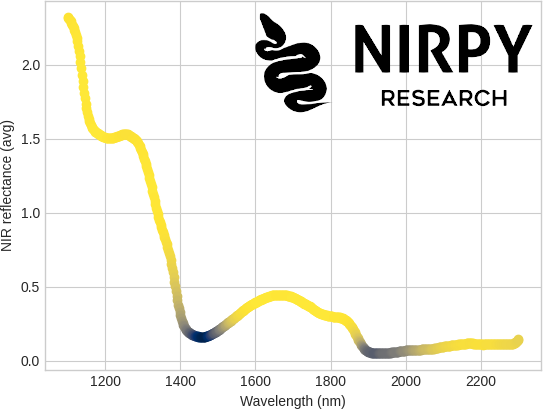 It turns out that the least correlated bands are the one where the absorption of liquid water is stronger, namely 1450 nm and 1940 nm. That makes sense, as water bands are expected to be presents in all samples equally (both types of milk will contain roughly the same amount of water) and the variations between the sample is nominally due to the lactose content of the different samples.
To wrap up, we discussed the PCA correlation circle as a useful tool to visually display the correlation between features (especially bands in your spectrum) and principal components. The correlation can be quantified through the Euclidean distance and used to colour code spectral bands for further insight.
Thanks for reading till the end. As always, I appreciate your support and don’t forget to share this content with friends and colleagues!
Until next time.
Daniel
It turns out that the least correlated bands are the one where the absorption of liquid water is stronger, namely 1450 nm and 1940 nm. That makes sense, as water bands are expected to be presents in all samples equally (both types of milk will contain roughly the same amount of water) and the variations between the sample is nominally due to the lactose content of the different samples.
To wrap up, we discussed the PCA correlation circle as a useful tool to visually display the correlation between features (especially bands in your spectrum) and principal components. The correlation can be quantified through the Euclidean distance and used to colour code spectral bands for further insight.
Thanks for reading till the end. As always, I appreciate your support and don’t forget to share this content with friends and colleagues!
Until next time.
Daniel


