
Aquagrams are specific diagrams used to chart the relative strength of the NIR reflectance (or absorbance) of selected bands from water or water-based (aqueous) systems. Aquagrams were developed together with the relatively novel approach of aquaphotomics which aims at studying aqueous system through the lens of the interaction of near-infrared light with water and its solutes. As the structure of the system changes, NIR water absorption bands also change. This change is detected and analysed through aquaphotomics and aquagrams are a very suggestive way to visualise the results.
In this post, we’ll be learning how to draw an aquagram using Python and Matplotlib. We’ll use a dataset of NIR spectra of honey samples with different types of adulterants. The dataset is made available courtesy of Dr. Mercedes Bertotto, formerly at the National Service for Agrifood Health and Quality (SENASA) in Argentina.
The basics: data pre-processing and bands extraction
We won’t go much into the details of the specific methodology of aquaphotomics for this specific dataset, but just summarise them here:
- Load NIR reflectance data.
- Select the wavelength range of interest.
- Transform reflectance into absorbance data.
- Apply Standard Normal Variate (SNV).
- Extract the bands of interest for the aquagram.
- Draw the aquagram.
Let’s start with the import
|
1 2 3 4 5 6 7 8 9 10 |
import numpy as np import matplotlib.pyplot as plt import pandas as pd from matplotlib.patches import Circle, RegularPolygon from matplotlib.path import Path from matplotlib.projections.polar import PolarAxes from matplotlib.projections import register_projection from matplotlib.spines import Spine from matplotlib.transforms import Affine2D |
Define the SNV (for more information see our post here):
|
1 2 3 4 5 6 7 8 9 10 |
def snv(input_data): # Define a new array and populate it with the corrected data output_data = np.zeros_like(input_data) for i in range(input_data.shape[0]): # Apply correction output_data[i,:] = (input_data[i,:] - np.mean(input_data[i,:])) / np.std(input_data[i,:]) return output_data |
We can now run through the items 1–4 of the list above. The data file is available for download at our GitHub repository.
|
1 2 3 4 5 6 7 8 9 10 11 12 13 14 15 16 17 18 |
# Load data data = pd.read_csv("Honey2021.csv", sep=";") # Select the spectral range of interest wl_1 = np.argmax(data.keys() == '1600.39') wl_2 = np.argmax(data.keys() == '1314.72') + 1 # Extract wavelengths and absorbance values for the selected range # Note that we are adding 1 to the reflectance spectrum because there are negative values # It's going to be irrelevant after SNV wl = data.keys()[wl_1:wl_2].astype('float32') # Reflectance to Absorbance # Some values are negative. Adding 1 to avoid errors with the logarithm operation spectra = -np.log(data.values[1:,wl_1:wl_2].astype('float32')+1.0) # Apply Standard Normal Variate spectra_snv = snv(spectra) |
Once again, the details of the pre-processing, may differ for your specific dataset and are not too important for the aim of this post. The point to keep in mind here is that we want to have a processed dataset of NIR absorbance data from which to extract the wavelengths of interests, which we call the water matrix coordinates (WAMACS).
In our case, these are
|
1 2 3 4 |
wamacs = ["1336.40", "1347.52", "1364.54", "1370.31", \ "1405.98", "1418.28", "1437.15", "1443.55", \ "1456.53", "1469.74", "1517.93", "1525.07", \ "1569.38"] |
The WAMACS are defined as a list of strings. For the sake of creating a list of labels for the aquagrams we will be plotting, let’s generate list of ’rounded’ WAMACS:
|
1 2 3 |
wm = [] for w in wamacs: wm.append(int(float(w))) |
Next, we are going to extract the indices at which these WAMACS appear in the dataset
|
1 2 3 4 5 6 7 |
# Extract the index of the wamacs and sort it in ascending order (just in case): wamacs_index = [] for w in wamacs: wamacs_index.append(np.argmax(data.keys()[wl_1:wl_2] == w)) # Sort the array in ascending order wamacs_index = np.sort(np.array(wamacs_index)) |
Finally, we extract the spectral values at these WAMACS and normalise the results
|
1 2 3 |
absorbance_bands = spectra_snv[:,wamacs_index] norm_absorbance_bands = (absorbance_bands - absorbance_bands.mean(axis=1 [:,np.newaxis])/ \ absorbance_bands.std(axis=1)[:,np.newaxis] |
OK, the data is now ready for plotting.
Aquagrams in Matplotlib: let’s start with a polar plot
An aquagram is a type of plot that can be categorised as a radar chart. It is in essence a generalised polar plot, i.e. a type of plot displaying variations on a radial and an angular scale.
A very easy first approach is therefore to build a polar plot in Matplotlib. We define an angles array containing equi-spaced angular coordinates with the same size as the number of WAMACS. We then plot the normalised absorbance bands of the last spectrum, corresponding to 100% honey sample
|
1 2 3 4 5 6 7 8 9 10 11 12 13 14 15 16 17 |
angles = np.linspace(0, 2 * np.pi, len(wamacs_index), endpoint=False) fig, ax = plt.subplots(figsize=(6, 6), subplot_kw=dict(polar=True)) # Draw the outline of our data. polar_chart = ax.plot(angles, norm_absorbance_bands[-1,:], linewidth=2) # Set the radial grid ax.set_rgrids([1, 0, 1]) # Fix theta axis to go in the correct direction and to start at 12 o'clock. ax.set_theta_offset(np.pi / 2) ax.set_theta_direction(-1) # # # Draw axis lines for each angle and label. wm.append(wm[0]) ax.set_thetagrids(np.degrees(angles), wm) plt.show() |
Which produces this plot
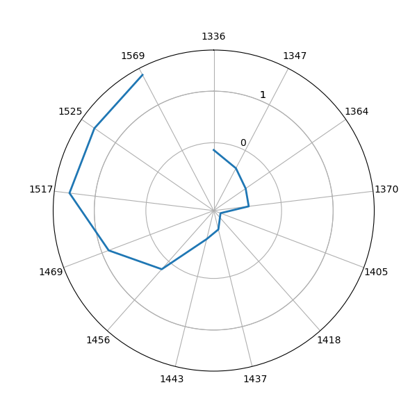
Not too bad for a start, however we would like to see the plot line to form a closed polygon. The trick to do that, is to copy the first data point at the end of the array, so that the first and the last points are the same. This requires some adjustment to the code, to display the first and the last point on the same spot. The simple fix is to manually add the missing line to the chart with a simple trick (starting from line 7 below).
|
1 2 3 4 5 6 7 8 9 10 11 12 13 14 15 16 17 18 19 20 21 22 23 |
angles = np.linspace(0, 2 * np.pi, len(wamacs_index), endpoint=False) fig, ax = plt.subplots(figsize=(6, 6), subplot_kw=dict(polar=True)) # Draw the outline of our data. polar_chart = ax.plot(angles, norm_absorbance_bands[-1,:], linewidth=2) for line in polar_chart: x,y = line.get_data() x = np.append(x, x[0]) y = np.append(y, y[0]) line.set_data(x, y) # Set the radial grid ax.set_rgrids([1, 0, 1]) # Fix axis to go in the right order and start at 12 o'clock. ax.set_theta_offset(np.pi / 2) ax.set_theta_direction(-1) # # # Draw axis lines for each angle and label. ax.set_thetagrids(np.degrees(angles), wm) plt.show() |
with this result

That’s the result we were after. We have plotted the absorbance values of one spectra at specific wavelengths and placed these values on a equally spaced angular grid.
The difference between a polar plot and a radar plot is in the shape of the grid lines. In the polar plot the grid lines are concentric circles. In a radar chart they are polygons. The difference is minimal, however Matplotlib does not have a built-in function to change the shape of the grid lines, so we need to write one ourselves.
Aquagrams in Matplotlib: a radar chart
Fortunately, the extensive example library of Matplotlib provides us precisely with what we need in this example. All we need to do is to adapt the example to our case. Let’s copy below the main function defined in that example
|
1 2 3 4 5 6 7 8 9 10 11 12 13 14 15 16 17 18 19 20 21 22 23 24 25 26 27 28 29 30 31 32 33 34 35 36 37 38 39 40 41 42 43 44 45 46 47 48 49 50 51 52 53 54 55 56 57 58 59 60 61 62 63 64 65 66 67 68 69 70 71 72 73 74 75 76 77 78 79 80 81 82 83 84 85 86 87 88 89 90 |
def radar_factory(num_vars, frame='circle'): """ Create a radar chart with `num_vars` axes. This function creates a RadarAxes projection and registers it. Parameters ---------- num_vars : int Number of variables for radar chart. frame : {'circle', 'polygon'} Shape of frame surrounding axes. """ # calculate evenly-spaced axis angles theta = np.linspace(0, 2*np.pi, num_vars, endpoint=False) class RadarTransform(PolarAxes.PolarTransform): def transform_path_non_affine(self, path): # Paths with non-unit interpolation steps correspond to gridlines, # in which case we force interpolation (to defeat PolarTransform's # autoconversion to circular arcs). if path._interpolation_steps > 1: path = path.interpolated(num_vars) return Path(self.transform(path.vertices), path.codes) class RadarAxes(PolarAxes): name = 'radar' # use 1 line segment to connect specified points RESOLUTION = 1 PolarTransform = RadarTransform def __init__(self, *args, **kwargs): super().__init__(*args, **kwargs) # rotate plot such that the first axis is at the top self.set_theta_zero_location('N') def fill(self, *args, closed=True, **kwargs): """Override fill so that line is closed by default""" return super().fill(closed=closed, *args, **kwargs) def plot(self, *args, **kwargs): """Override plot so that line is closed by default""" lines = super().plot(*args, **kwargs) for line in lines: self._close_line(line) def _close_line(self, line): x, y = line.get_data() # FIXME: markers at x[0], y[0] get doubled-up if x[0] != x[-1]: x = np.append(x, x[0]) y = np.append(y, y[0]) line.set_data(x, y) def set_varlabels(self, labels): self.set_thetagrids(np.degrees(theta), labels) def _gen_axes_patch(self): # The Axes patch must be centered at (0.5, 0.5) and of radius 0.5 # in axes coordinates. if frame == 'circle': return Circle((0.5, 0.5), 0.5) elif frame == 'polygon': return RegularPolygon((0.5, 0.5), num_vars, radius=.5, edgecolor="k") else: raise ValueError("Unknown value for 'frame': %s" % frame) def _gen_axes_spines(self): if frame == 'circle': return super()._gen_axes_spines() elif frame == 'polygon': # spine_type must be 'left'/'right'/'top'/'bottom'/'circle'. spine = Spine(axes=self, spine_type='circle', path=Path.unit_regular_polygon(num_vars)) # unit_regular_polygon gives a polygon of radius 1 centered at # (0, 0) but we want a polygon of radius 0.5 centered at (0.5, # 0.5) in axes coordinates. spine.set_transform(Affine2D().scale(.5).translate(.5, .5) + self.transAxes) return {'polar': spine} else: raise ValueError("Unknown value for 'frame': %s" % frame) register_projection(RadarAxes) return theta |
This code defines a new projection type, called ‘radar’ that can be passed as an argument of the polar plot. The function support both circular and polygonal grid lines, the circular case being identical to the previous case. The other functions are required to draw the polygonal lines in the right position and with the right scale. To take advantage of this function, here’s the code we need to run
|
1 2 3 4 5 6 7 8 9 10 11 12 13 14 |
angles = radar_factory(len(wamacs_index), frame='polygon') fig, ax = plt.subplots(figsize=(6, 6), subplot_kw=dict(projection='radar')) ax.plot(angles, norm_absorbance_bands[130,:], linewidth=2, label="100% Honey") ax.plot(angles, norm_absorbance_bands[-1,:], linewidth=2, label="100% Glucose") # Set the radial grid ax.set_rgrids([-1, 0, 1]) ax.set_rlabel_position(22.5) # Move radial labels away from plotted line # Draw axis lines for each angle and label. ax.set_thetagrids(np.degrees(angles), labels=wm) plt.legend(loc=(0.8,1.02)) plt.show() |

In addition to the previous case, we plotted two lines, one corresponding to pure honey and the other to pure glucose. As you can see, the aquagram enables a quick differentiation between the two.
As a final idea, if you want to generate a filled plot, like in the one shown in the featured image of this post, just use the command ax.fill instead of ax.plot .
Thanks for reading and until next time,
Daniel
References
- R. Tsenkova et al. Essentials of Aquaphotomics and Its Chemometrics Approaches.
- R. Tsenkova, Aquaphotomics: Water in the biological and aqueous world scrutinised with invisible light.
- G. Bázár et al. NIR detection of honey adulteration reveals differences in water spectral pattern.


